Data Visualization
-
ChallengeBackgroundMethodsSimulationAssessment
 Imagine that you’re a historian studying Napoleon’s invasion of Russia in the early 19th century. The only data you have to go on is a graphic representation of Napoleon’s campaign that was drawn in 1869 by Charles Minard. Your challenge is to study the graph and use it to make inferences as to what happened at different stages of Napoleon’s invasion of Russia, how Napoleon’s campaign ended, and why it ended the way it did. Are you ready to start your analysis? Then head on over to the simulation and see if you can be victorious in your conquest of data.
What is data visualization?
Data visualization is the study of visual representations of information. Visual representations are used to communicate data clearly and effectively. Data can be expressed through graphics and visuals known as information graphics or infographics. These infographics provide people with an easier way to grasp certain concepts or information through a visual perspective rather than other alternatives like just reading the data through text or a spreadsheet.How is data visualization different than other types of data representation?
Data visualization is different than other types of data because it allows us to see patterns and trends which we might not have seen before. Other types of data representations can include tables, graphs, and charts. Data visualization displays data like other forms of data representation, but data visualization is different because it includes additional context in relation to the data. The addition of context makes it easier for humans to grasp concepts better even though the same data is present. Data visualization makes it easier to explain data due to the use of art and graphics. Additionally, data visualization livens up a normal boring data representation leading people to look at the infographics longer. For example, in this data visualization, the different systems of the body are traced and plotted in the body. This could have been represented as a table, but with the visual of the locations of the body, it is better understood.)
http://richworks.in/2010/04/50-most-stunning-examples-of-data-visualization-and-infographics/
What is a lie factor?
The lie factor is a value of the ratio that incorrectly displays the effect of the data due to the inaccurate size of the graphic. The size of an effect should be proportional to the size of the graphic, but inaccurately drawn graphics can lead to erroneous conclusions. For example, this chart inaccurately displays how the income of doctors has increased between 1939 and 1976 compared to how the income of other professional workers has increased. The scale of the graph is skewed to make it look like both incomes are increasing at approximately the same rate:In reality, the income of doctors has increased much faster than the income of other professionals. This can be seen when the data is graphed using an appropriate scale:)
http://www.datavis.ca/gallery/lie-factor.php
When was data visualization first used?
The first use of data visualization was in the mid-19th Century during a cholera outbreak in London. Dr. John Snow was a physician who used maps to identify the source of the outbreak in 1854. Because the data was represented on a map, it was easy to draw theories and conclusions based on the patterns he saw. At that time, many thought that cholera was caused by pollution. With the map, Dr. Snow was able to disprove the theory of pollution as the cause. He noticed that many cases of cholera were centered around a water pump. Drinking the contaminated water was the cause of cholera and through the use of a visual, Dr. Snow helped stop the outbreak.)
http://en.wikipedia.org/wiki/File:Snow-cholera-map-1.jpg
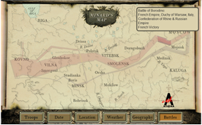
What is Minard's Map?
Minard's map was a map published in 1869 that depicts Napoleon's invasion of Russia in 1812. The flow map, created by Charles Joseph Minard, has not only the path that Napoleon took from the Neman River to Moscow and back scaled on a map, but also charts the size of the army at each part of the journey and the weather temperature on the retreat from Moscow. This was impressive because it was one of the first major data visualization graphics that provided clear readable data that people could understand. It was also one of the first to display different variables. The combination of the path on the map and the size of the troops was inventive, as readers could sense how Napoleon's troop size diminished at every stage. Additionally, the map also depicts temperature. It shows the cold freezing temperatures that Napoleon's army endured, which was one of the reasons that his army suffered the losses that it did.)
http://en.wikipedia.org/wiki/File:Minard.png
Walkthrough
Advanced Placement Lessons
Grade 6 - 12+ Lessons
Grade 3 - 5 Lessons
You need to log in to access this simulation.